
Icons
Add, manage, and reuse icons in your Wonder files.
On this page
Every Wonder file has its own icon library, which lives in the Icons panel in the sidebar. Icons are vectors, so they stay crisp at any size, and you can recolor them to match your design.
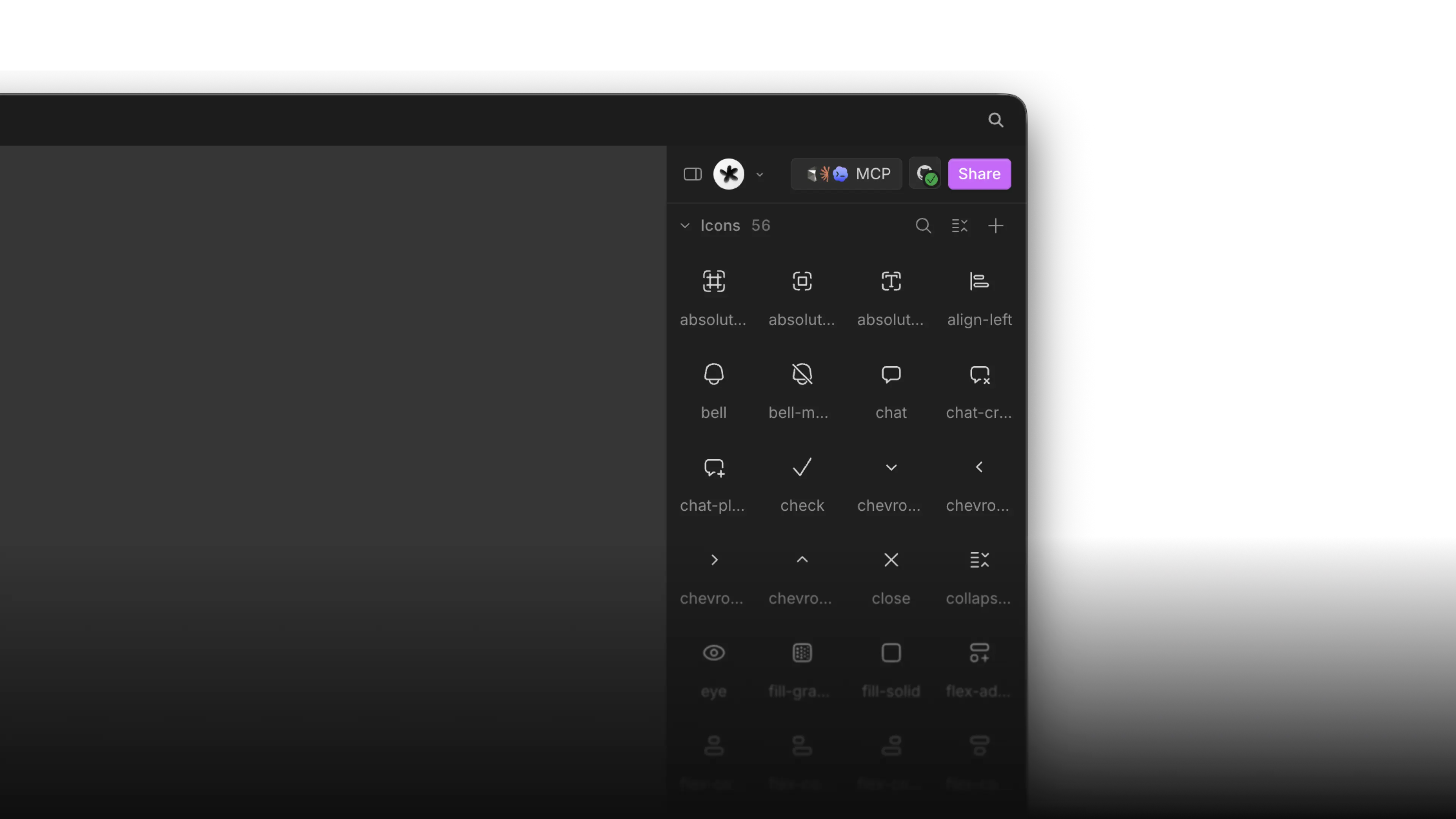
Add an icon to your library
You can build up your library in two ways.
From your codebase
When you connect a repository, Wonder can import the icon set your product already uses:
- Connect your Wonder file to your codebase via the GitHub integration.
- Ask Wonder AI to import your icons.
- Find them in the Icons panel, ready to use.
Add your own
You can also turn any SVG element into an icon:
- Add an SVG to the canvas via drag and drop, or generate an SVG using Quiver AI
- Select the element or frame on the canvas.
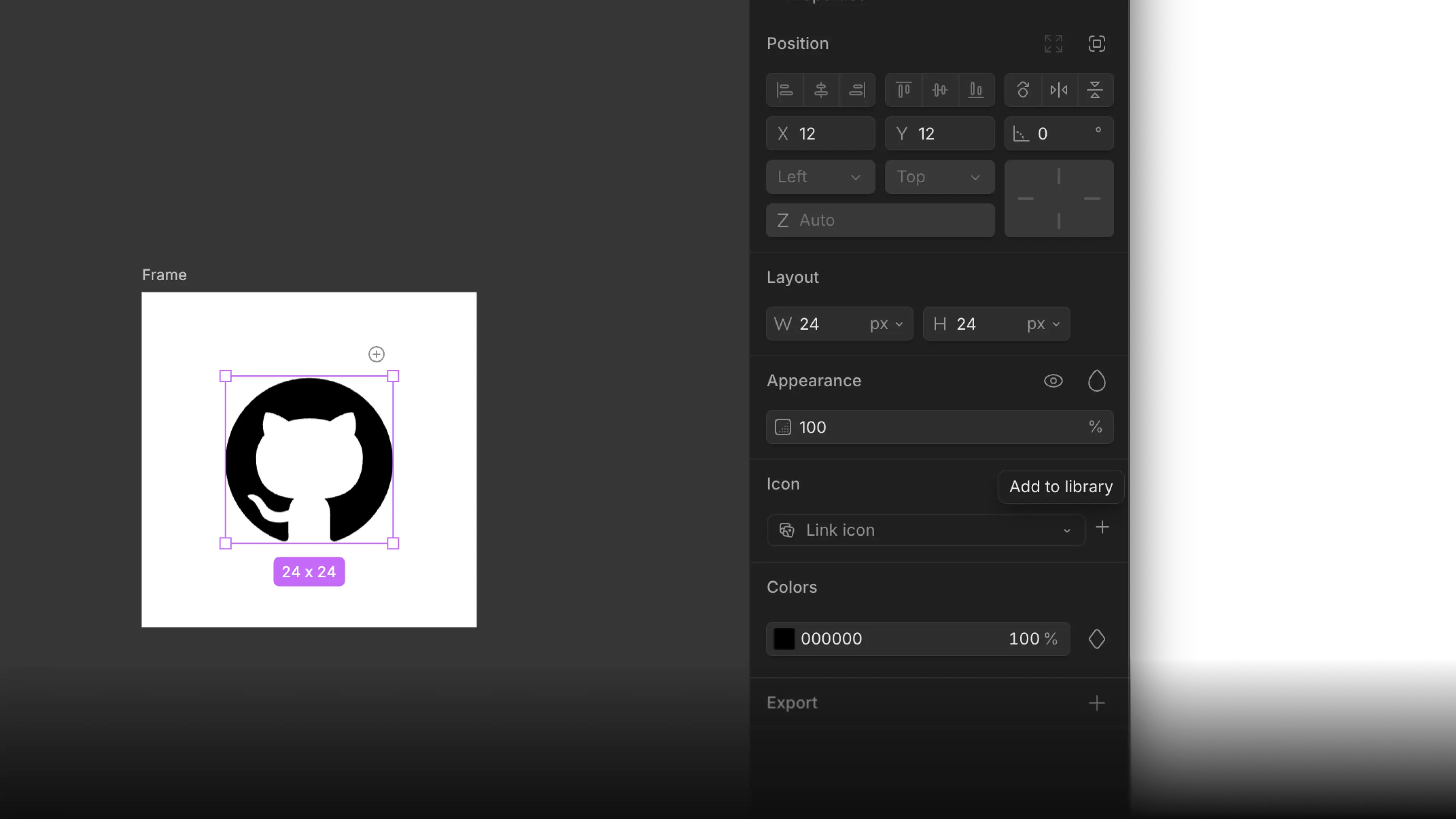
- In the properties panel, find the Icon section and click Add to library.
- It becomes a reusable icon you can use anywhere in the file.
Use an icon
You can either select an SVG from the sidebar panel, or replace it by selecting an element and clicking on "Link Icon".
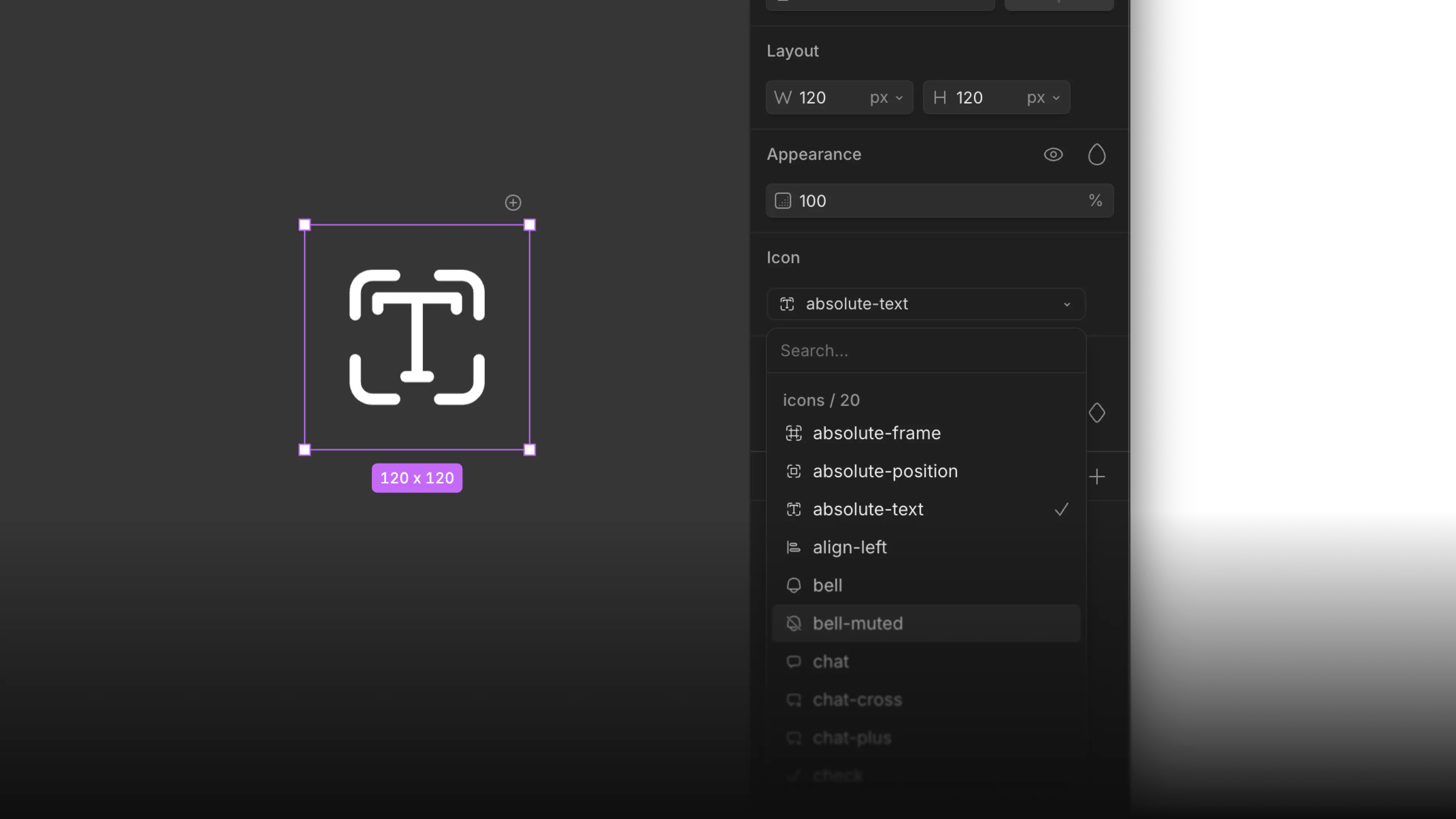
Once an icon is placed, you can:
- Recolor it from the Colors section of the properties panel. Icons also support variable colors.
- Resize it freely: it's a vector, so nothing gets blurry at any size.